I designed this program myself and I have been though all experiences. I would like to share with you some of them so you can find what we learn from them.
Mandala – Red
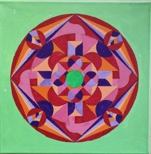
It took me a long time to create this mandala, approximately 4-5 weekends. Actually, I preferred to take my time rather than rush through it. That’s not really my usual approach. I went through the process twice, as I felt the initial version lacked sufficient detail. Eventually, I decided not to make any further changes and realized that it was just right. While implementing the layout, I found that there wasn’t enough space, so I had to allocate at least 50% of the area for the color red. Although it deviates from the norm, I still find it aesthetically pleasing. It’s not typically my style, as I prefer more symmetrical designs and sticking to the rules. However, similar to the previous mandala, it didn’t bother me. I still wonder why. I also dedicated a significant amount of time to selecting and harmonizing the colors as best as I could. It was a challenging task, but I enjoyed it. After painting only the red, I found the mandala to be truly beautiful and was hesitant to stop there. But this time, I decided to follow the rules and add orange and purple. The combination of red and green, along with the white highlights, created a magical effect, clearly showcasing the power of the red. I took a photo to preserve the moment.
Mandala – Blue
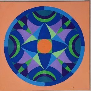
The mandala exhibits a circular proportion that I particularly appreciate. As you mentioned in your comments from the previous workshop, my yin side is likely more developed. The drawing of this mandala is less detailed compared to the previous one, and it took me less time. What struck me about the shapes, especially the center of the mandala, is the presence of two optional eyes enclosed in a square. It symbolizes my perspective on the world being confined within a rigid frame. To break free from this constraint, I added four additional eyes outside the square. I also realized that the split outer arcs of the circle could represent the moon, so I erased the dividing line. One aspect that caught my attention while painting is the convergence towards the center. The circular arcs resemble waves emanating from each “corner” of the mandala and moving toward the center, while the “eyes” point inward. In retrospect, I perceive the center as representing my heart, nestled within the austerity of the square and influenced by both the circles (representing yin) and the eyes (symbolizing the gaze of others, a recurring theme for me).
Here is the completed mandala, which I find wonderful and captivating. It differs greatly from the first mandala, which was highly detailed. The prominent blue color was essential, and I am pleased with the distribution of colors. I eagerly anticipate starting the next mandala. After completing this painting, my partner remarked that she noticed the increased care and attention I invested in it, compared to previous years’ works. I believe this is primarily due to the presence of a framework and rules that were not previously established. Indeed, I approach the creation of the mandala with great care, particularly during the painting process, but also throughout its entire construction. If I am dissatisfied with a figure, I am not hesitant to redo it. I also visualize how I will use the paint to achieve the most beautiful outcome possible.
Mandala – Yellow

The tracing of the mandala was more difficult than previous times. On the day I started it, I struggled to find inspiration. The structure of the mandala itself was relatively rigid, with segments predominating, and in this lack of inspiration, new segments and squares emerged in my mind. I had to meditate to find inspiration. It is true that this month, Yang energy has been predominant in my life. I started developing my transpersonal coaching website, which required both inspiration and technical work. This likely influenced my state of mind. Despite it all, I took my time with its creation, without rushing or getting frustrated even when I couldn’t find inspiration. I completed the mandala a little late, which probably contributed to the lack of inspiration (I felt rushed). I’ve noticed before that feeling behind schedule often stifles my inspiration, similar to a stressful position. It reminded me of my previous job where the demand was always to go faster, even faster, and always faster.
The mandala is now finished. I thoroughly enjoyed drawing and painting it. In fact, it’s always the case. I find it very well done. I particularly like the green and orange colors (on a yellow background). It evokes a sense of joy and celebration, and it gives me the impression of being in Africa.
I juxtaposed the color yellow but left the outlines of the shapes, giving a different structure to the mandala. That’s why I named this mandala “The Structure.” It’s actually quite similar to what I’ve been working on this month (my transpersonal coaching website). The website’s structure, pages, layout, content – they all require organization. Like this mandala, it also demands harmony, color choices, and their arrangement. Just like mandalas.
Mandala – Vert
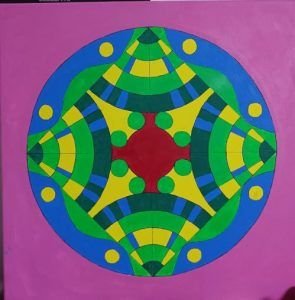
I am quite happy with the tracing and colors of the mandala. I completed the tracing and painting in a single day without doing anything else. It took about 5 to 6 hours. I made a few mistakes in the tracing and painting, but it didn’t bother me. In fact, I applied the mottos “let come what may” and “don’t put off until tomorrow”… and it worked out well in the end.
Regarding the tracing, since green is the dominant color, I decided to draw trees while still maintaining an abstract quality. The trees are decorated with yellow and blue, resembling Christmas trees. I also drew fields of grass, the sky, and the sun around the edges, represented by green/blue dunes and a yellow circle. I find the tracing neither too square nor too round. The colors seem to be in harmony, even though a part may appear dark green, it’s not actually the case in the original painting. Unfortunately, photos don’t always accurately represent the colors.
With the center being red, it can represent the heart, the center of action and energy that nourishes the trees (transformation).
Ultimately, the mandala truly represents the “earth” (that’s the name I wish to give it). The red center can symbolize the core of the earth. Then we have the trees growing from this same earth. We have the dunes of grass, and finally, the sky and the sun. The green color is centrally positioned between the sky and the earth.
Mandala – Orange

After creating several geometric mandalas, as you suggested in the previous recording, and seeing the beautiful green mandalas, this time I added detailed elements. I now understand that the mandala is composed of three main elements: structure, colors, and details. Ultimately, it’s a bit like our lives, where we need to be structured, colorful (with our emotions, joy of living, etc.), and attentive to the details that make it up.
When I started drawing the mandala (the structure), I found it good, and as soon as I began adding the details, I found it beautiful. The details truly change everything in the mandala and give it a vibrant aspect. It’s as if I brought it to life. I find it harmonious and much less rigid than the previous mandalas.
I feel that there is still untapped potential in my mandalas that I need to develop. This includes two things I don’t like doing in life:
• Doing the same thing twice: I like to think and do things in one go; I don’t like redoing things. Unfortunately, that’s not always possible in life. So sometimes, I leave things as they are, even if they’re not perfect or if I’m not truly satisfied. Yet, I could start over or make corrections. This can be seen in the creation of the mandala. I think a lot beforehand before starting, and then I hardly ever go back to what I’ve drawn or painted.
• Doing things that seem useless: It’s already much better than before. I used to think that school should only train us for our profession, and everything else was useless. Similarly, I initially focused my career solely on what was related to my job and what it could bring to it. Now I understand that some things that may seem useless are not necessarily so and can be beneficial in other ways. In the creation of the mandala, this translates into creating shapes that solely support the drawing of other elements. For now, I haven’t acquired this drawing skill yet; I still need to progress.
I titled this mandala “The Flower of Light.” I feel that this title reflects the light and energy emanating from this mandala. My partner loves this mandala; she finds it different from the others (more alive), and she adores its colors.